Truly, it is more than a little amazing that just nine weeks into the “new normal” is how quickly we have turned the “don’t compare this pandemic to the 1918 Flu” into “oh no! Look how similar our pandemic is to the 1918 Flu.” However, the truly scary thing we are facing is the amount of visual aids floating around that are actually inaccurate (when you sit down and fill in our dates)—not counting all the dissimilar variables that research and statistics would use to deem the comparisons horrible at best. Let me walk you through an example that has just made its way to my news feed, since a picture’s worth a thousand words…
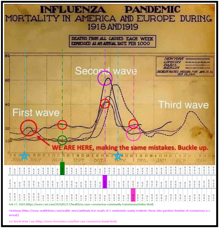
The Influenza Pandemic (1918 and 1919)
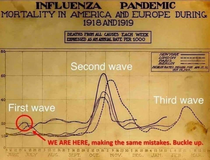
OK. Here you have a beautiful graph above which compares flu mortality in four 1918/1919 cities:
- New York—highly urban, port of entry for masses of immigrants, large numbers of tenements and impoverished residents
- London—highly urban, port of entry for refugees, wartime operations base for allies, large numbers of tenements and impoverished residents
- Paris—post-war life, large numbers of displaced war victims, sanitation and health protocols were very weak
- Berlin—post-war life, large numbers of displaced war victims, sanitation and health protocols were very weak
Now that we’ve established, in a very small nutshell, the general lack of modern health standards and modern medical establishments available in these cities (compared to a century later), what other variables could cause us problems in this image?
- The fact that the graph starts in June instead of February or Christmas, depending on your source for the start of today’s pandemic.
- The fact that there is no indication as to when this graph was made (though based on the circle when aligned with our weeks, it would have been mid-March at the latest, as I’ll show in a minute).
- The documented argument that the pandemic didn’t begin in June (as this graph implies with its 10-20 thousand death rates kicking off the lines—morality is what’s being tracked here, not known cases), but rather as early as mid-February 1918.
- The fact that the circle is marking only one of the “first waves”—that of Berlin, the post-WWI capital city of Germany, the defeated foe in the war that was already well on its way to a depression that made the U.S.’s Great Depression look mild in comparison.
- There is no indication whether this diagram is used for aligning the 2020 Chinese waves, U.S.’s waves or other nations’ waves with the circle.
- There’s no indication of why Berlin’s record stops mid-December, the U.S.’s stops late January, Paris’s stops mid-February, and London’s stops late March.
- The graph takes four internationally recognized global “leaders,” in size, economy, and social life, and wears the heading “Mortality in America and Europe.” Yet, the graph leaves out other war-ravaged metropolises of Europe, implying that they all suffered equally to the three (very different lines) depicted here.
- We have no indication as to the source of the graph—was it a graph published in the U.S. or Europe? Was it published in April 1919 or later? What were the sources used for the data and how accurate were the counts?
These are just a few examples of glaring variables which could cause some serious problems with using this graph as a model for our current global situation. Each of these points should raise a host of questions in your mind, the very least of which is: “How much impact would this information have on our use of this graph as a base model for this current pandemic?”
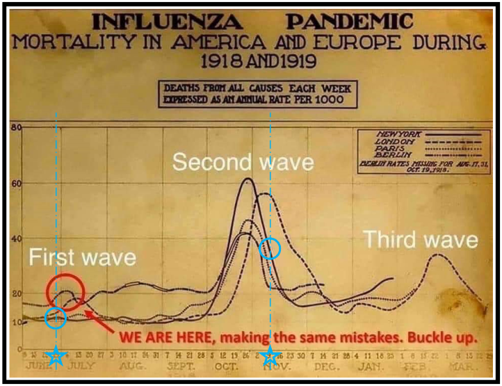
Another fun one to consider on the side is the correlation of “reopening the economy” right now with the “we’re celebrating the end of WWI!”
Here is the graph with the two “end dates” of WWI marked:
- June 28, 1919—The signing of the Treaty of Versailles (technically the end)
- November 11, 1918— Armistice Day (officially the end)
Of great interest to me is the fact that the first two waves occurred between these two dates—even London’s which was just coming off its second wave.
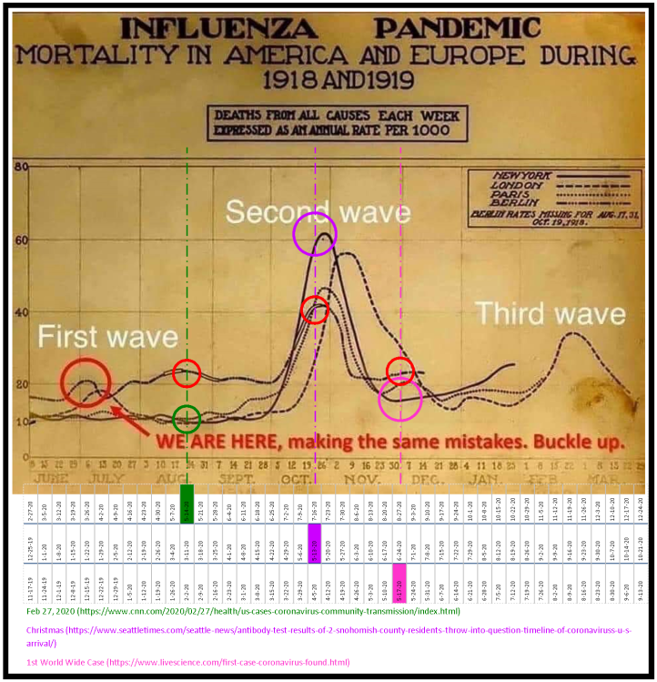
Let’s now align the 2020 pandemic calendar based on the different timeframes that are being used (I color-coded today’s date with the different start dates: green for February, purple for Christmas, pink for November; and red circles on the colored lines mark Berlin’s point of intersection and matching color circles match the U.S.’s).
Assumption #1
Here is the graph, assuming:
- The February date is actually the start date
- A February 27, 2020 start date of this pandemic as reported initially by the CDC
- A December 25, 2020 start date of this pandemic as currently being considered relevant by the Seattle Times
- A mid-November 2019 start date of this pandemic (globally) as was hypothesized in March 2020

Depending on how you want to read this (AKA which start date you want to choose), this graph can tell us that we’re in big trouble and haven’t hit the first wave yet, are somewhere between the first and second wave, or at the “just right” point to just about align with the graph being sent around.
If the third option, assuming a Christmas start date, is the accurate one, then we are really just finishing the first wave and we’ll hit the second wave around Labor Day. Notice though, that the American line in this modeling is not where the circle is, but rather where the lower two circles are and that it wasn’t until the second wave that American numbers spiked, even though the first known record of the Spanish Flu came from a tiny community in the American heartland.
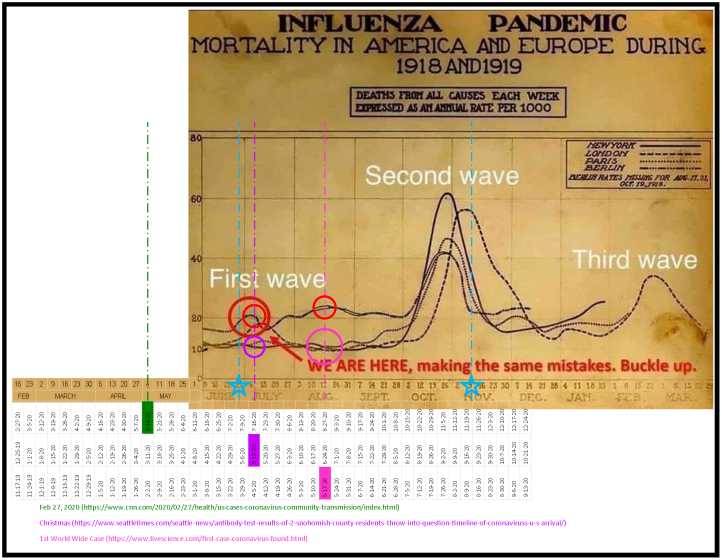
Assumption #2
Here is the graph, assuming:
- The June/July date is truly the ”First Wave”
- A February 27, 2020 start date of this pandemic as reported initially by the CDC
- A December 25, 2020 start date of this pandemic as currently being considered relevant by the Seattle Times
- A mid-November 2019 start date of this pandemic (globally) as was hypothesized in March 2020
In this model, we see that no matter which start date we choose to use, we are still looking better than anything the original graph wants us to believe. If we take a global perspective, as this graph is actually encouraging us to do, we are now about to hit the climb of the third wave!
A Few Other Caveats
First off, remember that this graph is clearly and merely giving a death headcount, not a percentage of deaths per capita. These numbers are, therefore, divorced from any understanding of how deadly the virus was in the differing settings (e.g. while more than 60,000 people are reported dead at the peak of the second wave, we don’t know if that is 5%, 10%, 50% or 95% of the total population of New York City). By not having the per capita comparisons, we have no way of telling if New York City actually had figured out a better strategy, had better living and working conditions, had generally healthier people, or had some other unknown variable at play.
Remember, too, that New York City, and any American city for that matter, had a significantly higher death count than most of the rest of the U.S. This graph is only focused on one municipality in each of four first world countries (three being capital cities).
Also, remember that this graph is also not comparing the overall total mortality, either by headcount or per capita, during this window of 10 months.
Finally, remember that the pandemic represented in this graph is touted to have been plaguing the world for two years…not the 10 months represented here. What happened to those lines that were supposed to continue into 1920?
Comparing to WWI’s End
OK, now let’s the above graphs the two blue lines marking the “last day” of WWI and see how we align…
Assumption #1
Assumption #2
Oh, wait! Look at that! Neither of the charts show the “reopening = celebration” correlation. In fact, if we’re looking at the closest one, we’ll see that we are well beyond the point of Armistice Day (by three weeks) and have nothing to fear from that argument!
Conclusion
Social and mainstream media has spent more than two months telling us this is:
- horrible and novel (science’s word for “new”) so we can’t predict what will come.
- will totally align with the 1918 Flu Pandemic, though every other flu pandemic since hasn’t come close to half of the devastating reality of the 1918 Flu.
- That we need to stay locked away in our homes for two full years in order to ride out this storm…yup, the one shown here in the graph.
You’ve seen the graphs for yourself. You’ve seen the possibilities simply off of three overly simplistic assumptions. It’s on you now. Don’t live in fear of lines divorced from any meaning apart from what you’re told it means. Answer these questions for yourself—then do something about it!
What will you believe?
What will you think?
